


Not all those who wander are lost … but most are: A wayfinding tour of City Hall

It didn’t take long for it to happen. If you spend any amount of time wandering around City Hall, it’ll happen.
“Hi, do you need help finding something?”
City Hall is gorgeous. Painstakingly built over 30 years, City Hall briefly stood as the tallest occupied building in the world when it opened in 1901. An architectural icon, it’s still the largest municipal building in America. The original blueprints – hand-drawn in ink on linen – gave elegantly simple instructions to the masons working on the exterior: “finish in an artistic manner.” And they did – there are over 250 architectural flourishes, bas-reliefs, sculptures and statutes adorning the Second Empire masterpiece. City Hall is majestic.
But it’s also maddening. For those of us too harried trying not to be late to a meeting, City Hall is a piece of art, all right – it’s a damn M.C. Escher.
I visited City Hall recently with Jerome Cloud, Virginia Gehshan and Stephen Bashore, designers at Cloud Gehshan Associates, a firm that specializes in making spaces more navigable. We were discussing City Hall’s room numbering system when a friendly city worker asked if we need directions.
“Every time I walk out my office, people are lost,” she said.
That’s why I invited the Cloud Gehshan contingent to walk around 1401 JFK Boulevard with me. Cloud Gehshan is an environmental graphic design firm, which means they are experts in the science and art of “wayfinding.”
At its most basic, wayfinding is what it sounds like: it describes how people find their way through a built environment. But like other self-descriptive terms like “urban renewal”, there is so much more to it.
Architect Kevin Lynch first coined “wayfinding” in 1960, describing in his book, The Image of the City, how designers use cues to orient people as they move through an unfamiliar building or city. At its most blunt, wayfinding means signs and maps, but pros like Brad Baer, Creative Director of Environments at BlueCadet, say its evolved way beyond that. “Before, it was just slapping signage on a wall and make sure the signs were all the same scale and color,” Baer said. But today, wayfinding looks holistically at the environment and the individuals experience, or “how it feels to interact with the space.”
“Wayfinding is definitely a science,” said Baer. “Part of it is the psychological aspect, and the other is the design aspect.“ Done well, wayfinding goes unnoticed. You simply arrive at your unfamiliar destination almost unconsciously, like you would in a familiar setting like your home. We only anxiously seek out signage when we begin to suspect we might be lost. As one wayfinding expert told The Atlantic, “Ultimately, if we do our job well, wayfinding enhances the customer experience without them knowing why or how.”
The City Hall Issue
Like all good conversations, wayfinding starts at the beginning. The first step in good wayfinding is creating an identity for each location. Arrival points should look and feel different from pathway, which should be different from destinations. Right out of the gate, City Hall stumbles.
City Hall, built on William Penn’s Centre Square, lies at the intersection of Broad and Market Streets. As a square, there’s no single, obvious point of entry. Instead, there are four openings into City Hall’s interior courtyard, each presenting itself as a possible entryway. But none of them is City Hall’s main entrance; the “Mayor’s Entrance”, used to gain access to most of the building, is actually in the Northeast corner.
When the design itself fails to clearly identify a location, we tend to rely on signs. But here City Hall disappoints again: There are virtually no exterior signs directing visitors to the Northeast entrance. It’s as unwelcoming as a building can be.
Disoriented visitors roaming the first floor hallways, searching in vain for the visitor’s entrance, might be lucky enough to find a semi-permanent, ad-hoc sign to finally point them the right way:
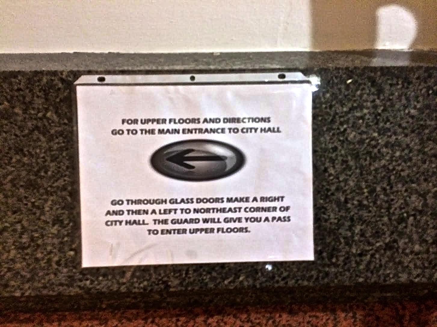
Or they might ask one of the many friendly city workers – if there is a silver lining to City Hall’s awful wayfinding, it’s that it dispels notions of Philadelphians as rude and unwelcoming – for directions like this: “Go out this door here, make a left, make a right, then make another left and go up the ramp.” Got that?
Once you find yourself past security and on the right floor, though, you’re still in for some wandering, even if you came armed with your destination’s room number. That’s because there’s very little rhyme or reason to City Hall’s numbering system.
“The organizational layout of the building is the underpinning of wayfinding,” said Gehshan. “If it doesn’t make sense to people, it doesn’t matter how big or clear the signs are. If the numbering doesn’t make sense, people will get confused. You have to address how people are using the building to know whether the numbering makes sense.”
While renumbering City Hall would be impracticable, Bashore suggested a simple proposal to significantly improve the situation: just add geographic designations to the numbers. Instead of just Room 132, make it Room 132-SE (or SE-132), letting those two letters signal which quadrant to start your search.
What City Hall does wrong in wayfinding, its newly renovated front porch, Dilworth Park does right. Whereas the old plaza was an uninviting maze with awful sight lines, and the subway stations beneath it as distressingly byzantine as the rest of the SEPTA concourse, Dilworth Park was designed with multimodality in mind.
Making space work for everyone
One of the hottest topics in wayfinding is multimodality – designing a space to make sense, regardless of how people get there by train, bike or foot. City Hall is ringed by roads, but it also sits on top of three transit lines. According to Paul Levy, CEO of the Center City District, improving access to those lines was a major reason for renovating Dilworth Park
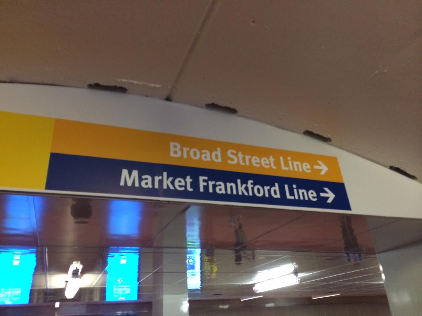
“From the beginning, this was a transit enhancement project, to make this the centerpiece of the transit system within the City,” Levy said. Levy highlighted how “the old maze” has been replaced “with one simple, clear new walkway” providing access to three major transit lines – the Broad Street Line, Market-Frankford Line and the Subway-Surface Lines.
Still, there are miscues. The familiar Flyers orange for the Broad Street Line looks almost yellow in the new concourse’s signs, which can confuse riders.
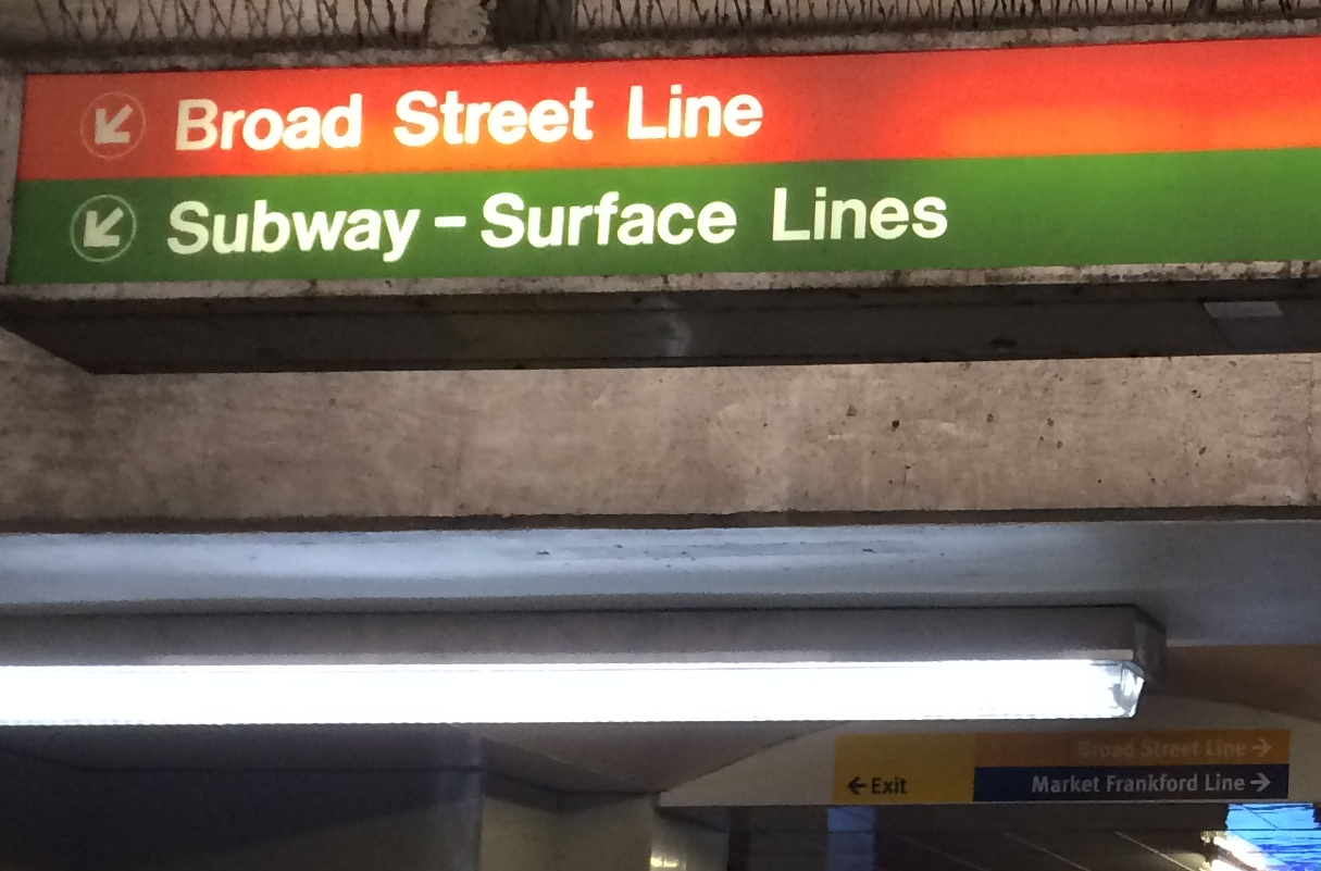
More importantly, the improvements underneath Dilworth Park come to an abrupt end as it abuts the SEPTA Concourse, which sprawls out from Suburban Station like an octopus in dark and murky waters. On its own, Dilworth Park is a wayfinding wonder, guiding visitors with subtle, manipulative cues that Rasputin would envy. But there hasn’t been – at least not yet – an attempt to harmonize Dilworth’s underground pavilion to the broader concourse, leading to jarring miscommunications like these signs:
There are positive signs
But the Park does better elsewhere. Jerome Cloud praised Center City’s Walk!Philadelphia signs, which were commissioned by the CCD in the ‘90s, and spoke optimistically about the city’s new Bike Share program’s potential to smooth some of the jagged edges to the city’s overall system. But, to me, Dilworth Park still felt like a shiny new steel link in a rusted out wayfinding chain.
While it’s obvious that the CCD and the Mayor’s Office of Transportation and Utilities understand wayfinding, that’s not so clear with SEPTA. Selling station-naming rights might make a little money, but at the cost of confusing passengers. Alternatively, the scrapping of R-numbering system on the regional rail caused a Tower of Babel moment, with old Philadelphians saying “R5” and newcomers saying “Thorndale-Paoli”.
Some gripes over SEPTA’s approach to wayfinding are nothing new: the buses and bus stops are almost entirely map free, making navigation of the bus system a time- and labor-intensive task. “That’s common in many cities,” said Gehshan. “People are afraid to get on a bus because they don’t know where they will end up.”
If you take the 31 bus, you’ll end up back at City Hall, where a bad numbering system and a lack of exterior signs are just the start of a bad wayfinding journey.
Let’s get oriented
The most obvious wayfinding problem with City Hall is the near complete lack of orientation signs. Orienting signs provide context for where you are and where you can go. One of the most basic orienting signs is seen in every hospital and hotel: the humble arrow pointing out that you’ll find rooms 100-150 to the right 151-199 to the left. To the extent any of these orientation signs exist, they are taped up pieces of paper, marring the comeliness of City Hall’s corridors.
There have been some improvements. Standing just inside the main entrance, Gehshan and Bashore marveled at the grandeur of the staircase there as a throng of visitors shuffled slowly along the long, snaking security line. Gehshan pointed towards a flat screen above the sign-in desk providing room names and numbers. “This is an improvement,” she said, giving the building its first, and only, wayfinding compliment of the day. But Gehshan wasn’t done. “The font is too small,” she noted. “You can’t read it.”
“And the yellow-colored text doesn’t help,” Bashore chimed in, pointing out how poor color contrast reduced legibility. They were right, of course – standing only 15 feet away, I had to squint to read it. And as union representatives and other concerned citizens filtered in, each asking for directions to the morning’s city council session, I noticed another glaring omission: Council Chambers was missing.
But the semi-permanent, jury-rigged paper signs are a more common sight. Even the sign labeling the main entrance is a taped up printout. They’re ugly and ineffective, but it’s not merely the aesthetics that are troubling.
Signs communicate certain things to their audiences – they can warn, inform, direct and more. Signs also tell you who or what is important.
There are purely designative signs outside nearly every office in City Hall, regularly updated to reflect who’s currently sitting in office. They don’t tell you how to navigate the space, or even the system, but they do let you know who’s in charge. Underneath most of these signs, you’ll find closed doors – a kind of sign itself, one that says “Go away.”
Meanwhile, directional and informational signs – the kinds of signs that point you towards council chambers or the right administrative office, the kinds that make government accessible – are nearly non-existent. This isn’t just about convenience or annoyance, it’s about transparency and accountability.
There’s plenty about City Hall that needs to be fixed. Philadelphia’s an international city, enriched by our many immigrants from all over the world, but City Hall’s signage is about as ESL-friendly as Geno’s. Chain-link fences along the portals’ interiors lend an unwelcome prison-esque vibe. The public restrooms’ stall doors are broken.
City Hall is a 19th century building trying to operate in a 21st century world, and the results aren’t always pretty. The city’s coffers are never full – some would argue that the lack of nice signs and other amenities is actually a product of civic self-sacrifice by our elected leaders – and what little money available could be put towards a million other worthy projects. Who cares about the symbolic impact of a few dinky signs?
I think Philadelphians do. This is a city where hundreds gather every day to look at a broken bell. Symbolism matters in Philly. The average citizen should be able to find their way through the halls of government, be they physical or metaphorical. Fixing City Hall’s wayfinding would be a sign of better things to come for Philadelphia.
-

SEPTA’s City Hall Station overhaul is on SEPTA’s list of deferred capital projects -

The long-awaited overhaul of City Hall and 15th Street stations will begin summer 2016. -

Center City transit concourse -

The $100 million City Hall Station overhaul is on SEPTA’s list of deferred capital projects -

Center City transit concourse -

Center City transit concourse -

(Jon Geeting) -

(Center City District) -

The fountain during the day. Echelman hopes visitors will interact with the fountain. Photo courtesy of Center City District Philadelphia -
 talking to people passing through Centre Square's subway concourse entrance, asking them to add their routes and stories to the big map.")
(Miriam Singer (right) talking to people passing through Centre Square's subway concourse entrance, asking them to add their routes and stories to the big map.) -

The new structure at the north end of Dilworth Plaza will house a cafe, entrances to the transit network below and an information booth
WHYY is your source for fact-based, in-depth journalism and information. As a nonprofit organization, we rely on financial support from readers like you. Please give today.
Brought to you by PlanPhilly

PlanPhilly
In-depth, original reporting on housing, transportation, and development.
")
Philly’s commuter foot traffic recovery stalls while Center City offices get emptier
A lack of commuters meant 8.1 million square feet of empty office space in 2023, up from 4.2 million in 2019, according to the annual Center City District report.
2 weeks ago

SEPTA is piloting a new gate to help stop turnstile jumping
The transit agency is testing out a new gate system at 69th Street Station that would replace the traditional turnstiles currently in use.
1 month ago
")
After series of crashes, SEPTA’s safety training may cause bus and trolley delays
The goal is to prevent accidents in the wake of a series of crashes involving public transit vehicles throughout the region.
9 months ago