


What if SEPTA had a better bus map? A rider tried making one.

SEPTA’s bus maps leave something to be desired. A few somethings, really.
First, good luck finding them. They are on the buses themselves, but that’s usually a little bit too late to be much use. Hopping on a bus unsure of where it might take you may sound adventurous at the start of coming-of-age tale, but it’s an annoying waste of time if you’re just trying to get to the theater.
You can find bus maps online, provided you know the route number. Again, if you’re trying to find your way from A to B, this isn’t very useful. And while you could ask Google or some other app to find you a route, you’ll only consider that option if you already know there’s a chance a bus might be convenient. That requires some understanding of how the transit system works, generally.
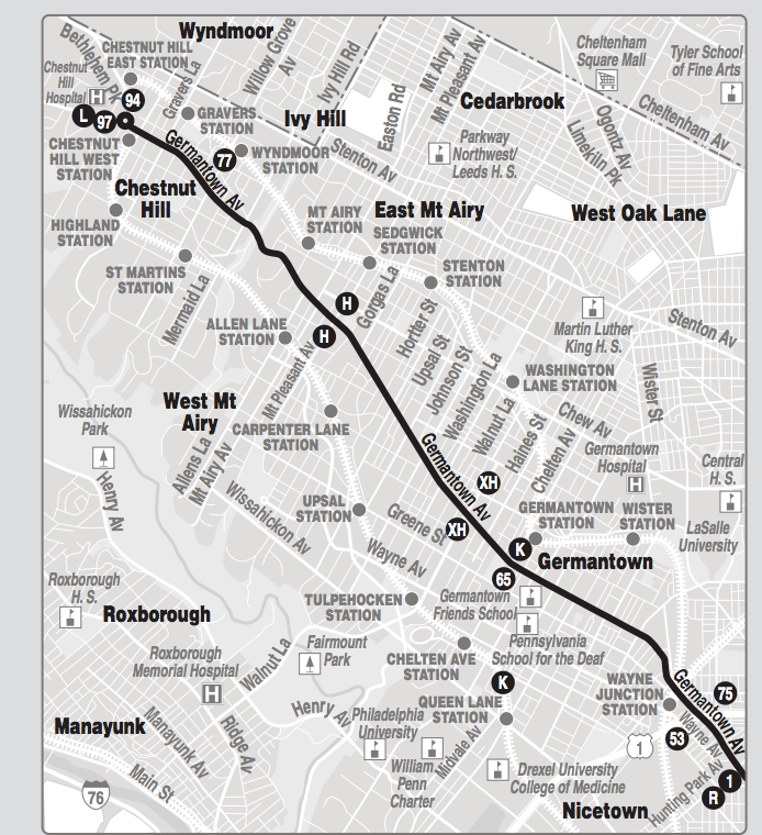
But once you find a SEPTA bus map, you’ll see that it’s mainly limited to showing you that one route, rather than how that route relates to the larger system. Take this portion of the Route 23 map on the left. It shows where you can connect, but not where those connections go. Imagine if you were at a party and needed to use the restroom, but rather than telling you where it was, the host merely said, “Well, that’s in the southeast corner of the house. This hallways runs east, there are doors that might head south. Good luck!”.
SEPTA’s bus maps—including those on some bus shelters, installed by Center City District—also don’t tell you how often the buses come. Some run so infrequently that riders rely on schedules to tell them when to get to the stop, not unlike regional rail.
But plenty of Philly’s buses run far more frequently—a new bus every 8 or 10 minutes—that passengers use them more like they use subways or trolleys: simply show up at the stop and wait for the next one.
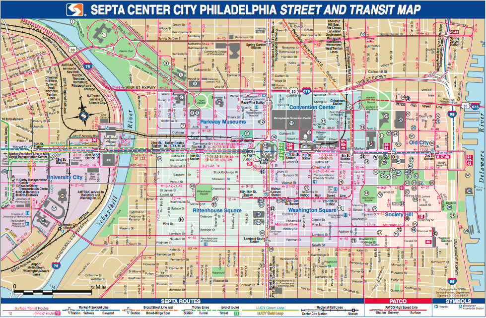
Unlike SEPTA’s rail transit, bus transit gets short shrift on SEPTA’s familiar transit map, which shows all the rail lines, even those that only run one train per hour, but none of the buses.
To Thomson Kao, that bias towards rail made no sense, so he set out to do something. Kao created his own, unofficial, frequent service map.
The map, which you can download in .jpg and .pdf formats here, shows routes where headways between vehicles are under 12 minutes on weekdays between 7:30 a.m. and 6 p.m. The thicker lines show lines where buses or trains come at least every 10 minutes, if not faster. It purposefully treats all modes the same: If a trolley doesn’t come at least every 12 minutes, it was left off the map, which is why you won’t see Route 15 running along Girard Ave on this map.
Frequency maps use line thickness to visually convey how often a bus or train should come. They’re a lot like roadmaps, notes Kao. “On a roadmap, we always classify a roadway by the type: interstate, arterial, tiny local streets.” Faster moving interstates get thicker lines than broad avenues, and tiny alleyways get the thinnest lines. The thickness on roadmaps suggests faster speeds. For public transit, how frequently a bus or train comes matters more to a passenger figuring out his route than how fast it might go once onboard.
The idea isn’t to show every bus route, or even most of them. Instead, it presents a picture of how the transit system works, generally. This benefits riders making an irregular trip the most—commuters don’t need this map to get to work, but it’ll help them get to a doctor’s appointment crosstown.
If you look at a comprehensive system map showing every route and geographic feature, it’s practically illegible. Like Japanese art, stylized maps like Kao’s use space and simplicity to their advantage.
Kao, who moved to Philly in 2012 to get a masters degree in city planning from Penn and decided to stick around after, said he was influenced heavily by Jarrett Walker, an influential transit consultant and proponent of frequency mapping. “The biggest thing I wanted to see was just how we can discover things,” says Kao. “Especially for a transplant like me: How can we discover other parts of the transit network that we’re not familiar with?”
There were some judgment calls that went into the map. Kao decided to switch the West Philly trolley lines from green to the bus lines’ red when they run above ground, saying they operate more like a bus when they share the road with regular traffic—Kao says he did so because, “trolleys might be getting too much emphasis in system maps and visitor info, while other bus-serve corridors that offer similar degrees of service are not getting their due notice.”
Why the 12-minute cut-off? Kao confesses that’s just just what basically felt right; any longer, he suspects people would be more prone to checking schedules rather than just showing up and waiting.
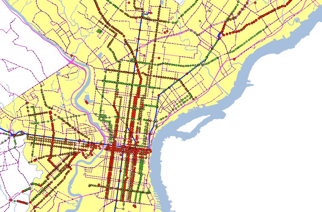
To build the map, Kao looked at SEPTA’s Google Transit File System data for headways and fed it into SQLiteBrowser to gather headway data, then mapped it in QGIS. After clearing up some bugs, he used the raw GIS map (see below) as a baseline to manually diagram the routes in Illustrator. All told, it took a few hours, spread over a few months.
Some caveats are in order: Kao freely admits that this was a first attempt for him and expects there are a few mistakes. It’s a diagrammatic map, not geographic, meaning he’s played with the spacing a bit for the sake of clarity. Technically, this map shows scheduled headways, not actual frequency—if buses run into delays and start bunching, you’ll end up waiting longer than 12 minutes, unofficial map be damned.
Kao says he’s shown earlier versions to some SEPTA planners, who found it interesting. His intention wasn’t to get his map plastered on every bus stop or launch a new career in cartography, though. It was to spark a discussion.
“I think there are a lot you could be talking about, like should we be charging for transfers, or investing in more corridors that don’t get attention. The map is about inspiring new ways of thinking about our network.”
As of publication, SEPTA officials had not yet responded to a request for comment about Kao’s map. When asked last year about developing new system maps like those currently being introduced in Pittsburgh, SEPTA told PlanPhilly that wasn’t something the agency was pursuing.
But Kao also posted the map on Facebook, and has already received dozens of comments from city planners, both amateur and professional. If his goal was just to get people talking, Kao charted a path to success.
WHYY is your source for fact-based, in-depth journalism and information. As a nonprofit organization, we rely on financial support from readers like you. Please give today.
Brought to you by PlanPhilly

PlanPhilly
In-depth, original reporting on housing, transportation, and development.